Sabtu, 29 November 2014

Those Canadian Bloggers


The finalists in each category for the Made in Blog (MiB)  Best Canadian Blog awards  as determined by reader voting have been announced.  

This is the first year I participated in the  awards process ( Home Design category).   Thanks to everyone who voted  for this blog because you helped Designing Home make it to the top ten.  A panel of judges will now decide the winners in each category.  Stay tuned for that big announcement. 

One of the advantages of my participation was an introduction to other Canadian blogs that I didn't know. Perhaps there's a blog or two in the list that you might like  to check out or follow.   Click  here see the  top ten  list for home design.

 You might also like to check in on  A Pop of Pretty, another St. John's, Newfoundland & Labrador  blog that's also in the top ten for home design.


Kerri  of A Pop of Pretty is currently participating in a Canadian Blogger Christmas Home Tour.  There are loads of close up photos of all her decorating efforts for this year's French Inspired Christmas Theme.  As she says in her blog description she loves all things pretty and there's no doubt that comes through in her space.

 If you'd like to see what other Canadian home owners are doing to get their homes ready for the festive season you can begin with Kerri and then link up to other open houses in blogland right across the country.  The link list is at the bottom of her post. 
As I followed the links myself,  I found another local blog Adventures of the Uncommon Common Law  from St. John's.  I thoroughly enjoyed  seeing Becki's take on a modern Scandinavian  inspired Christmas. And why wouldn't I?  Her space has lots of neutrals, textures, clean lines, and white- a graphic delight.

 After visiting the homes of all these young energetic bloggers here's me- the grandmother blogger-   ill prepared right now for the festive season.

 I have no home tour to offer, but  I will have a Christmas post or two when I get the hang of my fancy new camera.   My decorating efforts,  as you may know from past posts at Christmas, are  a bit understated and usually consist of recycling and rearranging what I currently have.  I've begun to pull things out, and I'm happy to report my husband made me a lovely trough box (from recycled wood, yet to be painted) for an arrangement.


 I'm feeling nostalgic this year and thought my granddaughters would enjoy seeing my collection of wooden Santas I've painted over the years. Until more exciting things happen here,  I'll leave you to enjoy the links above. Have fun.

Am I the only one who needs to get moving on Christmas?

Kamis, 27 November 2014

Choosing a drapery colour

Ah, the dreaded question.  What colour draperies should I have?

Part of being a decorator is making informed decisions about design.  Keeping current with trends  through reading and viewing is a must, but trend knowledge is not enough.  You have to understand what affect your choices will have on a space.

I posted this picture on Designing Home Facebook Page as an example of a style board I create for clients.  I am not one for vivid colour, but I didn't have to live with the colour, a young lady who loves rich colours did.   Should I have argued with her and said you shouldn't have bright draperies. NO!  I have to balance my client's likes with the principles and elements of design.

vibrant drapes, turquoise drapes, vibrant living room, Designing Home
Vibrant  draperies 

Let's look at what this colour choice  did for this room.

 You can't ignore this window treatment, it's not only the vibrant colour, it's the placement and amount of it. That means a lot of colour jumping forward in the space. The draperies also serve to  frame the artwork and the sofa. The more muted sofa is anchored and held captive, and you need an equally vibrant art work to compete with the windows. When you look at this space blue is primary and everything else is secondary.

The overall effect is focused and the room appears smaller than it actually is.  That's a great tip if you have a large space that you want to appear smaller/cosier.  Go for darker/brighter  window treatments that draw the eye.

 I see this as a lively, energetic scheme that is equally matched to a sparkling, vivacious young lady.


On to number two example....

soft white drapes, roman shade, fresh living room scheme, Designing Home

I removed the vibrant draperies and choose something more in line with my personal taste.  I like my spaces to be expansive, and tone -on tone- window treatments  (keeping the colour of the drapes and the walls very similar) is  one way to achieve that look/feel especially in a smaller space.  

Now the sofa and artwork stand out as they didn't before.  Your eye connects the light colour in the chairs with the draperies and you visually wander the space. 

On to example number three....  


fresh living room scheme, fresh green, turquoise


Same window treatments, but I'm tweeking a few other things. Without the blue pillows on the chairs,  and the blue vase on the table, the space is even even more opened up.  The overall effect is fresh and inviting,  reminiscent of a summer garden - always a look I gravitate to.  The wooden tables help that feel too. 

So there is no right answer to the question "What colour draperies  should I have?"  It all depends on how you want your room to look/feel. 

If you wan to find out more about current trends in window treatments check out this post and several others in my side bar. 

What's your preference when buying  window treatments ?  Are you a neutral or a colour lover?


Jumat, 21 November 2014

At Home: Get merry and bright!

 Rituals are an important part of our lives, even if they can be boring at times.  My official marker for winter is an appointment to get the tires changed on our car.  It's happened. Winter is officially here, even if we only had a dusting of snow followed by torrential rain.

 Each year as I  approach the end of November, Christmas creeps into my thoughts.


red chair, Christmas sign, outside porch, Christmas decorating

 While I love to look at all the seasonal additions other people make to their homes, and I marvel at the time and creativity it takes to decorate, I keep things as simple as possible.  I'm a vicarious decorator,  enthralled by others' efforts and the numerous possibilities without the physical work and outlay of cash.

 Here's a good example.

Every time I visit my daughter's house I am greeted by her inviting red door (now there are boxwoods in the planters) ...


red door, front porch, Christmas decorating,

and covered porch large enough to have two tables, a bench (made by her dad) and a chair.  


black and white patio, porch, outside decorating

This space is calling out for Christmas decorations now that the cushions are stored for the winter. 

Don't get me wrong, my daughter  doesn't need my help to decorate, and she's very independent.  For the last several years she's had some great looks for her front door, but this is the first Christmas for the bench on the porch. 


red door, DIY natural wreath, outside decorations, Christmas patio, porch
 2013 Wreath made from  her garden shrubs 

feather wreath, red door, Christmas wreath, porch decorations
2012 Sparkle and glam wreath 

snowballs, planter decorations winter, outside, porch, Christmas
2012 Glowing snowballs and white sparkle twigs
  What I liked about the feather wreath and snowball planter was its longevity into the winter months.  If you are putting effort into a project, you should aim to get the most from it. 

This is a "what if" post... what if I had that porch.  If my daughter is reading this now, she's rolling her eyes. I'm always on about something, and in the end she'll do her own thing as daughters usually do.

Let's start with the boxwood planters on either side of the door.


I have the cedar and my daughter has lots of silver balls.  Anchoring things because of the high winds is always a challenge.  I use tree ornaments and stick a wooden skewer  through the top and down into the soil.


Then there's  twigs and berries to add height and colour.  This is a great solution when planters bank a door because the added height and colour would be at eye level. 


porch decoration, Christmas, natural elements, silver balls

Following the dictate that simple is best, here's an idea to build on. This is an easy look to achieve and it invites modifications.  Not sure where you would ever find  gigantic pinecones in our neck of the woods, but you could certainly carry off the rest of it and make some bright additions.


front porch, plaid blanket, natural Christmas, black bench

How about a plaid blanket or plaid pillows for a nice splash of pattern and colour?  A definite considering plaid is very in this year (so I've been told).  I'm thinking about the  red plaid scarf my daughter just purchased.   It  could be folded around a summer pillow and pinned.  A piece of fabric would achieve the same look.   Presto!  Job complete - one plaid pillow.


black bench, plaid pillows, Christmas decorations, porch,
Here's a simple idea along those lines I just whipped up.  I know how much my daughter  loves happy little signs!  Not!  

or.....


burlap pillow, red chair, red polka dots, porch, outside decorations

 you could make burlap cushion covers with stencilled polka dots (a great kid friendly project)....

or

red pillow, red blanket, outside decorations, Christmas, porch

 you could use a  plain red blanket and blend it with  the summer white/black cushions for a very graphic look


... and 

Just a few simple changes to pillows 

and add bright arrangements for the table.... 


outside decorations,  red lantern, red table, natural Christmas, porch


Then there's always lanterns and greenery for the tables.   Get the spay paint out if you already have black lanterns.

natural Christmas, twig balls, outside decorations

Lit twig balls are always a big hit, and they could be added to any container depending on the size.  You can also spray paint twig balls and just go with colour and no lights. 


natural Christmas, red container, bird planter, winter decorations, porch


Why not take an idea from my sister Vera's  red bird themed Christmas pot from last year?  It continued to look good for months after Christmas. 


swag, door, skates, Christmas decorations

Love the idea of skates in a swag for the front door.  This would be super easy with a red door and lot of accessible greenery on one's  property.   And I just found my daughter's  little white (now yellowish) skates in the storage room clean out!  Ideas! Ideas!


bench, wreath, Christmas decorations, outside

Or just give in and put a  plain old wreath on the bench. How simple is that?

No pressure!

What are you doing with your entry for Christmas?

Selasa, 18 November 2014

Why you should photograph your home


I bet you have stacks of photos in albums or boxes  (if you are of a certain generation) or stored on external hard drives, on online sites like Flickr or in the cloud.  When you sort through all of them you may be surprised how few of them actually reference  the physical attributes of your home through the years.    I went looking for photos to do an entirely different post,  and ended up writing this one instead because I didn't find what I was looking for.


Whenever I see panelling I am instantly brought back to my teenage years.  I don't need a photo of my siblings at that time.  That one decorating trend conjures up all sorts of memories, and is as powerful to me as a photo of my family.


Add orange and avocado chintz fabric on a sofa and the memories are complete.  That's the power of our physical environment, the power of place.   And who can forget avocado green and harvest gold if you lived in the 60s and 70s? It was the backdrop for my post secondary education, my first job, and my marriage.


Later it was  the red shag carpet and flocked wallpaper in our  first house.  I know I'm dating myself terribly just to make a point.  NO, I didn't choose it, I inherited it and removed it eventually.  That was a difficult room to sleep in for someone who needs a calm environment.   I certainly didn't like the space, but I remember it for a totally different reason; it was the room I brought my first child home to.  A good thing she was a great sleeper with that wild wallpaper. 


 For my daughter this colour scheme will be her instant playback of her teenage years.   I hate to admit it, but we had lovely peach walls in our living room and cream, blue and peach wallpaper  in our dining room - with borders!  I had the perfect flow going from  light peach  to navy blue wallpaper and European cabinets in our kitchen.

 I'm sorry now I didn't put more effort into charting my "built environment"- colour choices, furniture, artifacts, and art work.   I actually had to go searching for images online to illustrate this post.

If I had more of my own interior shots,  I would lay them all out in a timeline and test my theory of embedded memories.

Is it just me or do you think your home is as important in your memories as the events that happened there?


Senin, 10 November 2014

Accessorizing: Learning from a pro - Vicente Wolf

Part 4 of 4 Accessorizing your home

I am intrigued by the designs of Vicente Wolf.   I've studied them as I study compositions by famous artists  in an effort to dissect  the lines of design, and the thought processes he engages in as he creates beautiful spaces.  In my opinion a good  design never looks too put together, too matched, but has  an effortless, collected feel. His always do.


source


source

Pale backdrops  and a mix of antiques and cultural artifacts are his trademarks, but there is so much more to his designs.  When you observe his work closely you find that there are design features he is drawn to that get repeated in variations in different spaces.  While each space is unique, you can see similarities in  his choice and arrangement of objects.

source

His background in photography obviously informs  his interior design aesthetic or maybe it's the other way around.  When I look at any space he has created, I see so many compositions within compositions, layers that cause you to look throughout his spaces.  I am  also sure they are photographed  to make you do just that.


The artist in me is attracted to how he organizes random objects into vignettes (object compositions).  So after much viewing, thought, and reading, here's what I've learned from this brilliant, self-taught, New York designer.

Repeat  still life elements


source

Wolf  often uses a painting to inform a vignette created near it.  Elements are repeated from the artwork as in the tree and scrubby plants  in the tray.The three candles mimic the strong vertical in the left of the painting and there's really three table tops- one in the art, the table itself, and the tray on the table.

Layer furniture


source

Not only is layering furniture a way to deal with limited space and provide versatility to meet various entertaining needs, it is also an effective strategy  to  provide visual interest and a focal point in an otherwise simple space. I like how the  large ottoman (often a signature piece for Wolf) is the only pattern in the room.  It is also a way to move  circular shapes around  an otherwise rectangular space.


source

Another idea for layering a table and an ottoman. Circular motifs play in this space too.  Have you noticed the use of higher tables? 

source

Circular motifs and layering under a bedside table.  The textural and geometric  elements of  pieced or woven wooden elements are also prominent as you can see below. 


Use texture and geometry in wood


Sometimes these effects are used over mirror to create intricacy and depth. 


source

Suspend mirrors/art  in space


source


 Frame  compositions in compositions 


source

This vignette illustrates  how to organize objects and frame them with what lies behind.  In this case the fireplace frames the vignette in front of it.  I also love how the mirror acts as an additional backdrop element in this vignette.

I'll finish with an important observation.  While I have highlighted some of the common themes I see in Wolf's designs I do not feel that his spaces are all the same.  He obviously feels it's important to work with clients to create personal spaces for them.  When you look at the slideshows on his website this is very apparent.  As he notes in Lifting the Curtain on Design (one of my favourite design books of all time)  page 128, " I know how to paddle a canoe.  But I approach each river in a different way"


If you're intrigued check out this interview done by Canadian House and Home.


And here's a great read  if you like the glimpse I've given you of this designer's work.  

Floating shelves, mixed chair styles,  limited patterns, repeating shapes and so much more not covered here.  I am limiting myself severely on this topic because I would break my self imposed post length rule. 

Feel free to add your comments to keep the conversation going. 


Senin, 03 November 2014

At Home: Finishing touches for a contemporary home

Accepting a visitor/decorator into your home to deconstruct it in words and pictures is not for the faint of heart.  There's  an element of trust in this endeavour, trust that I will represent the home in a truthful and pleasing way. Knowing this, I am always so pleased when homeowners accept my proposal to highlight their home and discuss elements of their decor that I am interested in writing about.  Once again I have willing participants in my At Home series.  

Come along to see what the Erls have been up to for the last six months since they moved into their new home in the east end of St. John's, NL.


WELCOME


The entrance to this home provides a pleasing welcome with it's bold colour scheme and inviting landscaping.  As you move inside you soon realize that the exterior is an extension of the overall feel and colour schemes utilized inside. 

A neutral background


It is very obvious that Gail and Gary are  detail oriented people because  great attention is given to  both the  permanent fixtures  in their home as well as the smaller details. This is a warm home even though the majority of rooms are painted  Benjamin Moore CC40 cloud white, a tried and true warmish white.   Thankfully I don't have to try to put a positive spin on a cool white (e.g.,  Benjamin Moore decorator's white) which I am not in the least attracted to.  Thanks for making my job easier!
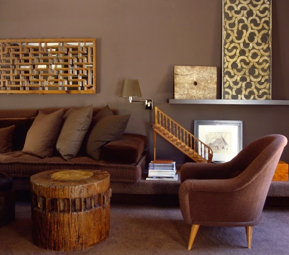
High contrast


high contrast black doors, black stairs, dark wood finishes


One of the most striking aspects of this home is the high contrast between the  darker wood finishes
( hardwood, doors, stairways), and the light tile, walls and windows.  The stained glass transoms created by Don Ryall were designed to parallel the one in the entry.  Two additional transoms over the entries to the kitchen carry this patterning and contrast into the centre of the house.

Vibrant accent colours


Gail has broken up the neutral framework with her love of vibrant colours liberally employed in her accents.  With each room having a different accent colour ranging from blues to orange and red you are kept interested as you move from room to room.  There is definitely an up beat feel to the space.   Knowing that Gail is a gardener, I would describe her accent colours as a garden palette.

Function and form


When you choose basic colours you can move things around to see where they look best. Gail's accessories for the most part are functional objects: pillows, clocks, baskets, vases, candles, trays, throws etc., which are easily interchanged.  While I was photographing, I had the urge to do just that to show the versatility in her collection of objects, but that might be another post. 

Use what you have

One of the struggles many people have in a move to a different style and size of home is carry over.  Often what looked great in one space, just doesn't work in another even when you keep much of the same furniture.  When I questioned Gail about this she estimated she reused about 80% of her things.  She believes  her interest in certain colours remains constant, and much of what she purchases can be used in a variety of settings.   Pillows are quickly updated with new covers, while vases, a particular favourite, alway work in a space for flowers/greenery, or to add a sculptural element to the simplest arrangement of objects.    Re-using accessories is a responsible approach to decorating, and it also provides the much needed time to find the final finishing touches.

Wood tones as a backdrop


Since the vibrancy of her accent colours are reminiscent of a riot of colourful flowers,  a range of wood tones in furniture and accessories  provide  a great foil this the bold intrusion of colour. Mixing wood tones throughout a space creates warmth and carries hints of nature throughout  a home.  While some people get carried away with efforts to perfectly match wood tones,  a more eclectic approach provides greater interest.  Choose one to dominate and be flexible with the rest.  For more on  how to integrate wood tones like a pro check out this post.

Inspiration


When asked about sources of inspiration, Gail admitted she has a  weakness for decorating magazines, and also watches  certain decorating shows.  But there is no doubt in my mind that she takes much of her inspiration from nature because it is referenced repeatedly in her home.

A good example of this is the art work over the bed in the master bedroom.  Not only does it bring us into a relaxing day by the sea it also relates to the lake that is visible through the windows.  As you can see, window treatments are minimal and frame the great views.  


European travels  have obviously had an impact on how The Erls' choose to organize and furnish their home from the single European duvets to the  clean lined aesthetic evident in every room.


The soft cream accents from the bedroom are darkened to a soft gold in the ensuite. Again, you can see nature references in the grain of the storage boxes and the content of artwork.


Seasonal decorating


If you choose the right accessories there isn't much you need to do when special events roll around. Gail and I  have the same decorating philosophy about seasonal decor!  The answer to all her seasonal decorating is colour specific to the season supported by what else - flowers and greenery.  Pop in a few orange flowers in the tray you saw in an earlier pic  and you're ready to go. That's where her vase collection comes in. She  also liberally uses fruit and vegetables in her arrangements.

Vignettes


Chuckle, chuckle... decorating speak for arranged objects.  It's the perfect word in my book, but I've gotten some strange looks from clients when I use it.   There is definitely an art to arranging objects in a pleasing way.  In essence, you are creating a 3 dimensional composition.  Check out this post for lots of tips on the various lines of design you can use when composing  arrangements.  In addition, the top three things to remember are: 1) odd numbers of objects; 2) varying heights; and 3) variety in colour and texture. Then there's: repetition, balance (symmetrical and asymmetrical) and overlapping. I see all of these elements/ principles used in Gail's arrangements.

For many people decor decisions are usually made at the  instinctual level.  Each of us is attracted to various colours, shapes/forms, textures, etc., and how  they can be organized.  Often we may not be aware of our biases.  I told Gail I would seek hers out for the post.  As you can see in the collage of kitchen shots above, she has a definite attraction to vibrant colours, repetition of form and threes.


Notice the repetition of rectangles above in the art, tray and the counter, as well as a strong vertical orientation in the vase and flowers. The curves in the apples, vase and flowers help to  counteract the straight lines.

Of course, you have to completely ignore the electrical collage behind the interesting one! Wouldn't we love a house where all the functional elements could disappear into the walls?


A fresh apple green is repeated throughout her powder room.  Here there are threes again and a strong vertical orientation in the daisy art work.  I've made my own vignette/collage and added the bottle and branches from her stairs. It really does work better on the stairs, but you get the idea about moving objects from room to room when you have accent colours that work well together.  See the hint of orange in the tissue box and the the centre of the flower.... ah, the possibilities with this green and that dark wood.

Sightlines


Sightlines are often forgotten elements in home decor.  Looking through into another room or down a hallway and having an anchoring element/focal point to tease your eye is a way of providing interest.


When you enter the foyer in the Erls' home and open the door to the living area you are greeted by this eye catching photograph of  their daughter, Karen taken by J. Reid Studios.  Not only does it provide a focal point from the entry, it continues to have a strong visual pull in the living room and dining room. 


Arranging things below such a striking piece  takes restraint because the portrait  has to shine.  You can see that the majority of  objects are darker, simple forms of varying heights.  Adding colourful things to this vignette would not have worked  half as well. The plant provides softness and connects well with the other plants/flowers in the room.   Also notice how the objects form a zig zag effect as they are arranged across the long expanse of table top - one of the best strategies for console tables. Balance is created without symmetry.


red Ikea media cabinet, Asian influences, kimono, vignette

When you walk out of the guest bedroom or up the main stairway this vignette greets you.


european duvets, striped bedding, red accent bedroom, accessories


The red is carried forward into the guest room and ....


...the orange from the kimono is used as an accent in the main bath.

There's so much more I didn't write about, but I've generously sampled the finishing touches in this home.  Thanks so much to the Erls for graciously agreeing to have us tour their home.


 Perhaps you have a favourite element or room or you  would like to share your ideas in the comments.