Selasa, 26 Juni 2012

How to choose drapery hardware

The devil is in the details and simple decisions can lead to big impact both good and bad.  Since there aren't any  absolutes in decorating, things often  come down to personal preferences.  One of the the things I'm fussy about is what colour rods to use to hang drapes.


There's lots to choose from.

Metal hardware is available in a variety of finishes : wrought iron,  aluminum, chrome, brass, and oil rubbed bronze. Wood hardware is available in almost any finish, from natural blond to dark espresso.
types of drapery rods
Styles of drapery hardware
 There's two ways you can go when choosing a colour for your rod. Choose a color that matches:
  •  other items in the room
  •   the colour of the drapery   
  When you choose to match  other items in the room it is often a good idea, but it doesn't always work as you can see in the photos below.

black drapery rods bedroom

It is obvious that the rod colour decision was based on matching to the dark woods in the room, but why would you want to break the lofty look that is going on here with horizontal dark lines?  When I look at this room, my eye automatically goes to the ceiling.  Contrast always draws the eye.  You probably don't want a focal point near the ceiling! 

black drapery rods printed drapes living room

This rod is also dark, but the same thing isn't happening because the drapes are highly coloured and patterned.  I still would not use black.  In fact I probably would rarely use black because it is too harsh unless you have black drapes or it is a very modern decor. In this room I would look for something lighter that blended with the wooden blind too and make the whole thing more of a unit.

This is a good neutral colour when you have golden tones in a room. 

You also have to watch where you use wooden blinds. The combination below really works.   

bamboo roll up bamboo drapery rod  

 This is a very cohesive look.  When you add wood blinds you automatically introduce a more casual element to the space and usually the colour is lighter. Choose your rod accordingly.

back pleated drapes light gold rod

 This rod has enough colour to be noticed and it allows the drapes to have center stage. Imagine what a different room it would be if the rod  were black.

black drapery rod with banded drapes

How do you feel about this rod choice with these drapes?  Certainly  the black isn't as harsh as in some of the other examples, but it does compete a little too much with the horizontal banding for my taste. Personally I would choose something more neutral  to  match the top of the drapes.


light drapery rod cohesive look

A pulled together look. 


What are your thoughts on choosing an appropriate drapery rod for your space. Do  you have an aversion to black rods in light spaces?

Minggu, 24 Juni 2012

Not your average colour scheme

Some colour schemes are a dime a dozen and others are just daring and interesting. Today I'm looking at salmon/coral/melon and pink/rose/magenta.

Now I'm not saying I would use these colours in my own home. You can appreciate from afar without committing!  These rooms have just too much colour for my personal style.  I'm attracted to them because they are so vibrant and fresh.  Isn't it a good thing we don't all like the same colours?

 How do you feel about these rooms?  If you could transport any of them into your own home would you?

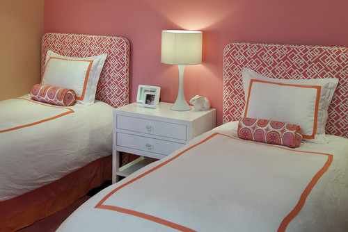
This colour scheme seems to be most popular in bedrooms. 

 Interior Designer Artistic Designs for Living, Tineke Triggs

The white bedding  and accessories work well to balance the hot colours.  White has many uses in decor and acting as a backdrop is just one of them.


You can't deny that these colours are great for a kid's room.  I'm really liking the hit of lime green as an accent.


This is the subtle version of this scheme.  Just a hint of melon with a deeper pink. Both are tempered with lots of off white.  That seems to be a common thread through most of these rooms.

More vibrant colours against light walls and furniture. The pink is leaning toward purple and there isn't that much of it. 

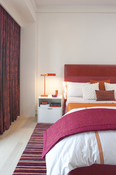
 This room turns it around and focuses on a rich magenta with smaller pops of orange. Do you think the headboard is dramatic enough or would you like to see a big piece of art over it?


Do you fancy one of these?

Living rooms


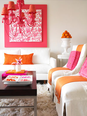
 Lots of white to play with these two vibrant colours. I'm longing for a little more pattern, perhaps a stripe with a third colour thrown in to replace the pink cushions. 

Here are some choice....


I would go for the purple one. How about you?
 
 While we're at it what let's think about the white vase... Hummm...

Choose one.  No matter what pillows you choose there's a vase that works.

  Can a room be over matched?  YES!


Deeper pink leaning toward red with just hints of orange give a totally different look.  In this room a neutral tan  in varying values serves as a backdrop to the vibrant colour. I like the fact that this room is not too over matched.  Lots of pattern in the pillows.


Simplified Bee�: Sweet, Modern Pink & Orange Nursery Room for Baby...